TSkew-T/Log-P Diagram
This help is from the University of California-San Diego. Colors and plot
content may differ from the Arctic and Antarctic plots provided at this site.
The skew-T (skewed temperature/logarithmic pressure) diagram is an instantaneous picture of the
temperature, humidity, and winds in the atmosphere above a particular point on the earth's surface
in a column from the surface to about 16 kilometers (km) (10 miles) above mean seal level. The horizontal axis is
temperature in Celsius (C) (water freezes at 0C and boils at 100C). The vertical axis is atmospheric
pressure in millibars (mb), which decreases with altitude. 1000 mb is just above the earth's surface
for stations near sea level (and may be well below the earth's surface at mountain stations), 700 mb
is about 3 km (10,000 feet above mean sea level (MSL)), and 500 mb is about 5.5 km (18,000 MSL).
The measurements depicted in the skew-T diagram are collected in a "sounding" of the air in the
column (using a sensor package carried aloft by a balloon).
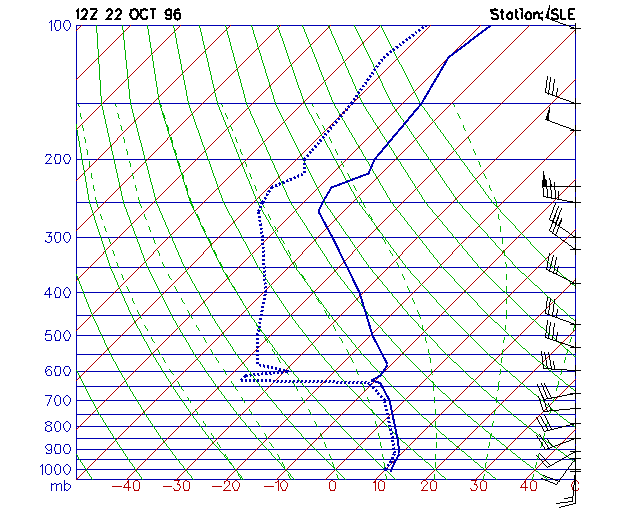
The solid blue line is the temperature from the sounding. The temperature is measured on the chart
by the red grid that slants (is "skewed") right with height. This slant is set so a temperature that cools
at a normal rate with increasing elevation will show as an almost vertical line. The dashed blue line
is the dewpoint temperature, a measure of humidity. Where the dewpoint line is far from the
temperature line, the air is dry; where close, wet. The closer the lines, the higher the humidity.
Where the two lines overlap, the air is saturated (humidity is 100%). When the lines are close or
overlapping, clouds are likely. If a saturated region is sufficiently thick and close to the ground, it
is usually raining or snowing. In this diagram, there appears to be a thick cloud layer from the surface
to about 3.5 km (12,000 MSL). The solid green lines that slant up to the left are "dry adiabats"
which represent how the temperature of dry air would cool if it were pushed upward ("lifted"), or
warm if pushed down. The dashed green lines are "wet adiabats" which show how the temperature
of a saturated air parcel cools as it moves upward (temperature can not warm by moving down a wet
adiabat as the air would immediately "dry" to less than saturated conditions).
The wind barbs (found along the right edge of the diagram) show the direction the wind is coming
from (the shaft of the barb) and the wind speed. In this case (which is from Salem, Oregon on
October 22, 1996), the winds are from the south at the surface, from the southwest in the lower
atmosphere, then veer (the direction changes clockwise) westerly to northwesterly with increasing elevation.
The lines attached to the
tail of the shaft indicate the speed. A short line indicates 5 knots (nautical miles per hour, abbreviated
as kts) or 5.75 mph, a long line is 10 kts (11.5 mph), and a filled triangle is 50 kts (57.5 mph). If one
triangle, two long lines and one short line were on a wind barb, it would indicate 75 kts
(50+10+10+5) or about 86 mph.